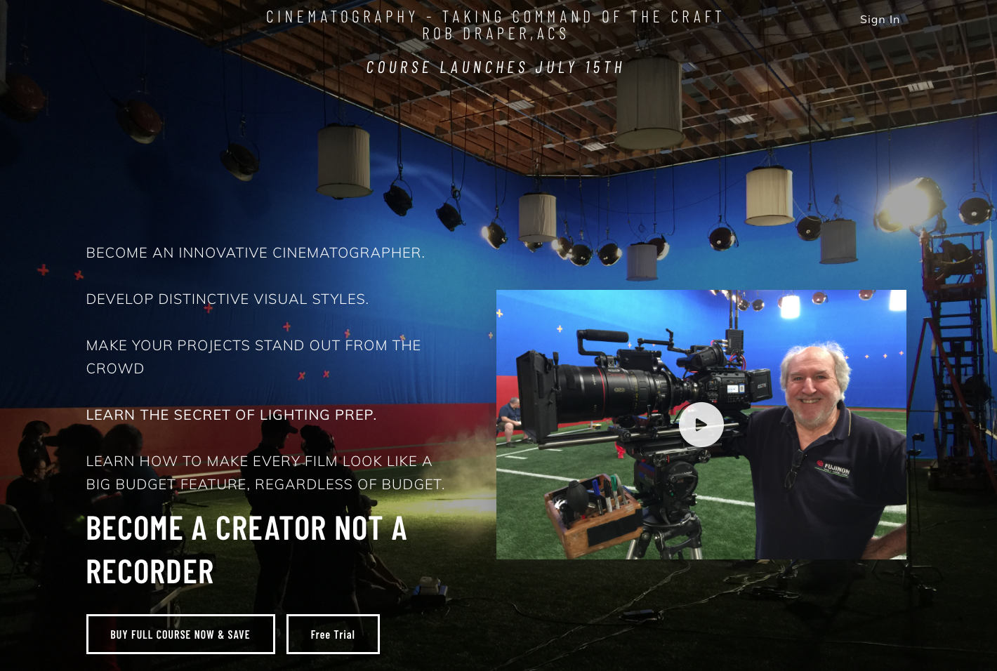
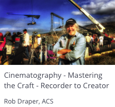
If you are a cinematographer on a plateau, an aspiring cinematographer or a student of cinematography you should take a look at my new online course.
Over a 40 year career I have seen and worked in film, video , HD and Digital. In many cases I helped in the development of the camera systems and filmstocks. All that gives me a pretty good insight into what you need as a Cinematographer to deliver innovative and creative work.
Setting up individual, great looking shots is easy but developing and maintaining lighting continuity and a strong visual style require a special understanding and set of skills.
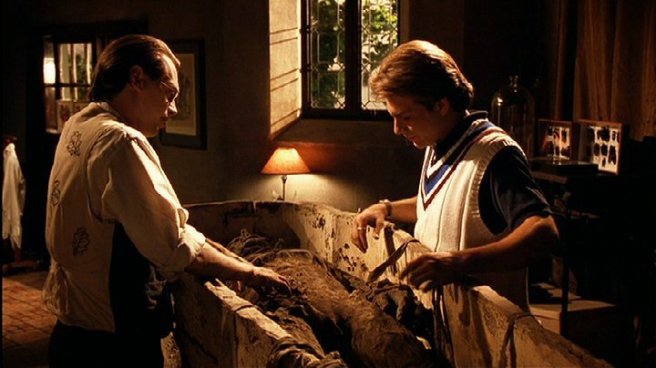
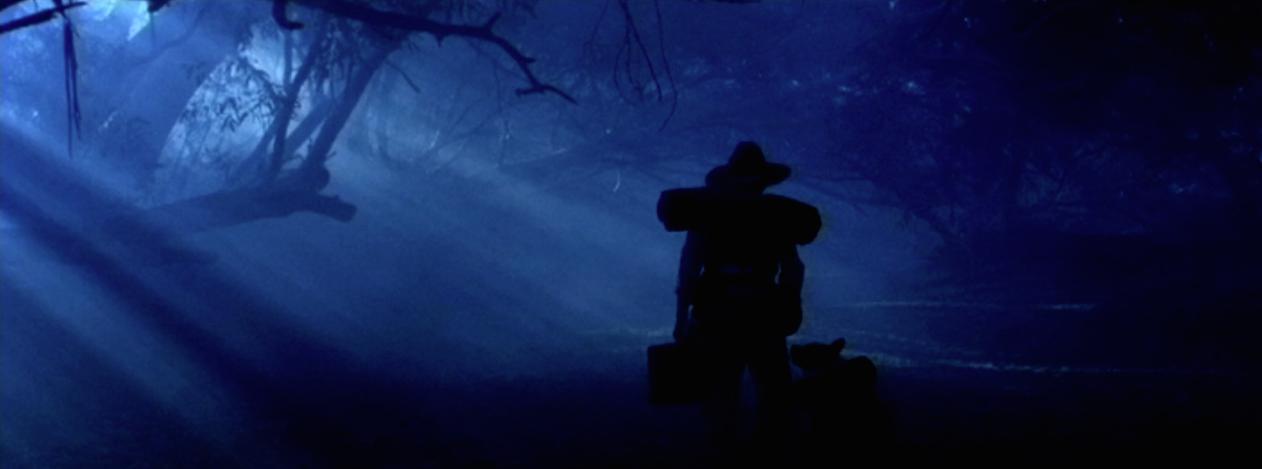
The Adventures of Roman Pilgrim was one of, if not the, first Hi Def films for theatrical release shot in Australia.
The film, conceived, written, produced and directed by talented Aussie Filmmaker Anny Slater, shot on the Panavised SONY 950 camera in Tibooburra, far western NSW. It is a fantasy which, in brief, tells the story of a young boy searching the Aboriginal songlines for his “voice”.
“Roman” featured an original score by renowned Jazz Musician/Trumpet Player James Morrison with Christopher Horsey (“Bootmen”) as “Roman” starring and choreographer, The Topp Twins as “the Fates” , David Ngoombujarra (“Down & Under”) as “Albert”, Michael Veitch (“Fast Forward”) as the “Guardian of the Threshold, Taryn Laleen as “Spirit Guide”, John Morrison as “The Butcher” www.swingcity.com.au
As a side note, shooting at the intersection of Sth Australia, NSW, Qld and Northern Territory and working on a limited budget, we needed to shoot as much as possible available light with only reflectors, bounces and careful attention to sun position. All the dreamtime dance sequences were shot totally available daylight with each angle timed to the position of the sun.
After discussions with Anny we decided to shoot flat 2.35:1 aspect ratio on spherical lenses to make the most of the outback locations and the wide theatrical screen. The aspect ratio also worked well for the staging of many of the scenes which required vast wide shots as well as substantial separation between the actors.
Shooting 2.35:1 meant much attention would have to be paid to the horizon line, particularly as one of my pet peeves is horizon lines jumping up and down the screen in the edited scene. I wanted to overcome those jumps and, at the same time use the horizon as part of the storytelling.
I had shot a film many years earlier, In Broad Daylight starring Brian Dennehy and Marcia Gay Harden, about a guy who terrorized Skidmore Missouri, eventually to be gunned down by the townfolk (true story). My goal was to use the horizon to tell a subliminal part of the story.
In the early part of the film I wanted Brian to be towering over the landscape I shot from lower angles and in particular, on exteriors, kept the horizon running cutting Brian between chest and knees. As the film progressed I moved the horizon line higher until he was eventually trapped by the landscape.
In “Roman” my goal was the same. Use the horizon to help drive the story subliminally and that meant ensuring the horizon did not draw attention to itself by “jumping” up and down in the frame across edits.
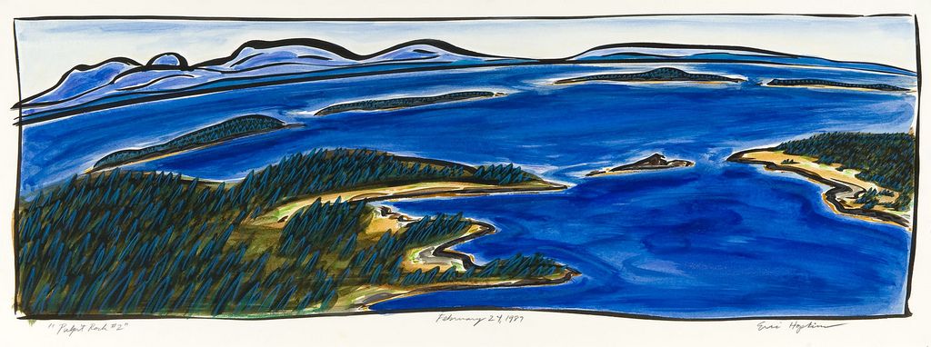
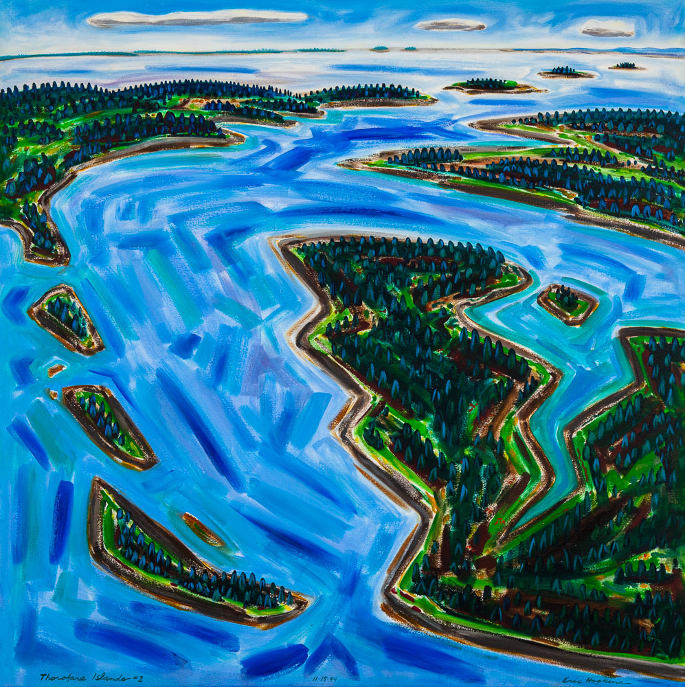
I shot many tests on an SLR for “Roman” and decided to have a chat to my pal, one of America’s top artists, Eric Hopkins. Eric paints Maine landscapes and he tends to see his world from 10,000’. This obviously means he puts a lot of thought into placement of the horizon in his paintings. We had discussed horizons many times before but now the discussion could turn to implications for the moving image.
Who is Eric Hopkins? Watch the following short video I shot with Eric on his approach to horizons for another project several years back. He was in the process of taking his art 360 degrees by combining with glass.
I hopped an early morning ferry for the 60+ minute ride out to Eric’s studio on North Haven Island.
We talked at length about where the horizon should be, with my primary concern the “jumps”. I had an idea that the horizon could be played at angles through the frame which also meant the actors would be angled as well.
Eric grabbed some cardboard, cut out a 2.35:1 frame, drew a this line across a table and we started playing. We were both surprised to discover that the more off horizontal the horizon became, the more interesting the picture. However, that was great for static shots or one angle but how about intercutting?
I shot loads of stills, transferred them into Final Cut and edited shots into sequences and surprisingly, intercutting also worked better with large departures of the horizon from strictly horizontal. (Watch one of the tests below).
Next was to test the theory with people in the shot. I photographed family members in different compositions…WS, MS and CU and then cropped and dropped them into the frames with the horizon line. It worked, for intercut still frames so my theory was it should work when the actors and the camera were moving.
In fact it did, and it worked brilliantly (if I do say so myself). Strangely, when watching the film the angle of the horizon and the actors was not noticeable to audiences, unless they were told about it up front. If it was mentioned after a screening they could not recall.
Further, the actors, even though to camera at crazy angles, always appeared normal but with a tension and dynamic in each shot that would not have been apparent shot conventionally. Steadicam work was a challenge but Steadicam Operator Andrew “AJ” Johnson was all over the wacky angles and pulled off some stunning compound shots tracking the dancers and maintaining the horizon placement.
Sadly, you do not get the full impact of the technique on a small computer or tv screen. I really works best on a big screen. However, you will see in the following short assembly it does definitely add a different dynamic to the story.
We shot the film in Sydney, Australia in 2000…only a few months before the Olympic Games. Needless to say shooting on location for all the exteriors was a challenge, with all the advertising for the Games plastered on billboards, walls, shop windows, buses and taxi’s, requiring some creative angles and staging, particularly given there was little to no traffic control.
The film covers the life of the Three Stooges from their early days in Vaudeville in the 1920’s, through the creation of 22 years of shorts for Columbia Pictures to their “rebirth” on stage in Boston in 1959.
For budget reasons we shot on 16mm so rather than see that as a disadvantage I used the format as the basis of the visual style making use of the grain structure, higher contrast and color rendition. The increased depth of field would have posed a problem but I decided, as is pretty much normal for me, to shoot wide open for interiors and exteriors. This was only for the flashbacks and “current day” elements. The black and white shorts needed to be shot with very wide DOF.
Having to shoot 1959 as current day, the 20’s through ’59 as period flashbacks and also recreate, with absolute accuracy, several of their black and white shorts, was the real challenge.
I decided to shoot the bulk of the film in Super 16 with a 1.85:1 aspect ratio. This largely because the shorts, to be strictly accurate, had to be shot in a 1.33:1 ratio. Choosing the widescreen ratio for everything other than the shorts gave the shorts more “separation”.
The shorts also needed to be black and white.
I chose three filmstocks.
“current day” interiors and exteriors Eastman Kodak EXR 7248 100T
“flashbacks” interiors and exteriors Eastman Kodak EXR 7298 500T
“shorts” Eastman Kodak EXR 7245 50D
This choice gave me a variety of grain size and contrast so simply by changing the stocks I had higher contrast between all three elements. I added further to this by exposing all flashbacks at T2.8, all current day at T8 and all shorts at T16.
To develop the visual style for the show I decided on a shifting color palette through all the flashback and current day material using coral filters and slowly phasing them out as time progressed to shooting completely clean for the current day. Being on 16mm added grain, although shooting on the Kodak T grain stocks it was nowhere near as apparent as it would have been several years earlier. I used the grain as an element of the visual style.
The idea was current day would feel slightly colder, more neutral and have higher contrast whilst the flashbacks would start very warm and, by progressively decreasing the strength of the filtration, slowly bring the color to match the current day.
I used a combination of coral filters, black pro mists and the varicon for all the material other than the shorts and shot close to wide open on generally longer lenses where possible so depth of field was shallow. As we progressed through the years I slowly increased the lighting contrast, reduced the intensity of both the corals and pro mists and brought the look back to match “current day” 1959 with no filtration and higher contrast lighting.
The shorts required a great deal of research and some testing. We could not shoot black and white due to studio policy so had to go with color stock.
In the period the lighting on all the shorts was hard light, the sets were generally one wall sets (sometimes two) and most were shot on a single lens. Filmstocks were slow and lenses were not very fast so I figured choosing the 50ASA/ISO stock in combination with a T16 stop and hard light would bring me close to the original.
Director Jim Frawley had decided on the shorts we would shoot so working with Production Designer Larry Eastwood we decided to paint all sets in shades of grey, dress the actors in shades of grey through black and shoot on slow, 50D, daylight stock using HMI’s so there was no filtration and no need for tungsten daylight color balancing in the grade.
The other reason for the 50D is it behaved almost like a reversal so I had much higher contrast built in before putting up lights. This was further necessary as the original shorts were lit relatively flat and shot at a T8 stop.
Note: some of the shorts were presented in 4:3 and others in 1.85:1 The reasoning was to differentiate between screening room viewings and live action filming of the scenes.
Shooting the shorts and flashbacks on different stocks, at widely different apertures, led to another challenge as the Director wanted on camera transitions of the boys going from behind the scenes onto the B&W set and coming off set. This required very different lighting between the on set material and the behind the scenes material, as well as filtration.
To accommodate the transitions we carefully set up each transition so it was an individual shot on the 50D stock. I could light the behind the scenes area for a T2 and the shorts set to a 16 and we blocked the shot so I could execute a large iris pull which would be hidden in part of the set, the actors movement of by passing through a shadow. Of course in the grade each of those shots had to be graded to B&W. In the final edit only a few of the on camera transitions were included.
One of the biggest problems in the shoot was staging the scene with Curly and the clam chowder. It looks a very simple scene but the challenge was to shoot the scene on the equivalent of a 35mm lens (as it was in the original 35mm photography) whilst holding the top of the counter and framing over Curley’s head. The problem was to go wide enough to hold the shot we needed to go to an 18mm lens and pull further back…which made the shot very wide and we saw off set.
To come in close, as the camera was in the original, and shoot on the 35mm equivalent, we had to raise the counter to get the bowl in shot but the counter had to be so high it was ridiculous. After watching the original and trying multiple lenses and camera positions, one of the grips saw what was happening. Basically the camera would be set up in essentially one position and the set wall would be adjusted to accommodate the shot. Easy in most cases because the sets were only a single wall most of the time. So we popped on the 16mm lens, moved the set wall in until it matched the original shot and voila, problem solved.
We also made quite a lot of use of steadicam throughout on the “current” and flashback material….to help counterpoint the static nature of the shorts. Steadicam was used however, to drive the story, not as a gimmick, so the moving camera was always structured in to the storytelling rather than being an excuse to move the camera. Steadicam shots were used as single shots, not intercut with “coverage”.
This covers the basics of the development of the visual style for the film. If you have any questions you can contact me by email or through Facebook.
Some screen grabs from Tales from the Darkside. Came up during a seminar in which I was using one of the segments as an example of real-time in-shot scene transitions using compound moves, theatrical scrim and lighting techniques. Much more interesting than CGI.
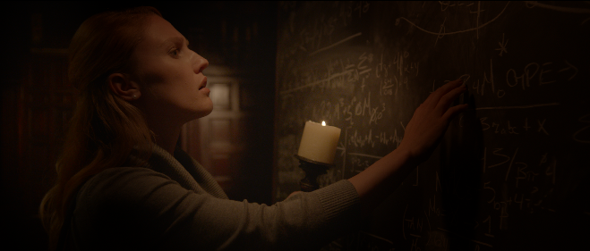
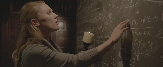
I have had quite a few questions regarding the candle scene frame grab I posted some time back. To answer the questions I have included a series of still frames and a brief explanation of what I was doing to get the final look I wanted. It is important to realize the final was not an afterthought but was what I was after. I therefor needed to light for the elements that were going to be important in the final grade.
1. This first panel shows the original image as recorded in the camera. I recorded in logC so the image has an enormous amount of detail but appears very “flat” and without contrast.
When I am lighting the shot on set I know exactly what the final image, after color grading, will be so I light the shot in a way that gives me all the elements I will need in the grade to make it work. Essentially what I record on set is my raw material as the final image is always made in the “printing” stage. That was true on film and is the same in digital. The trick is I have to “see” that final image before I start lighting the set so I am sure I have all the image detail I will need later on.
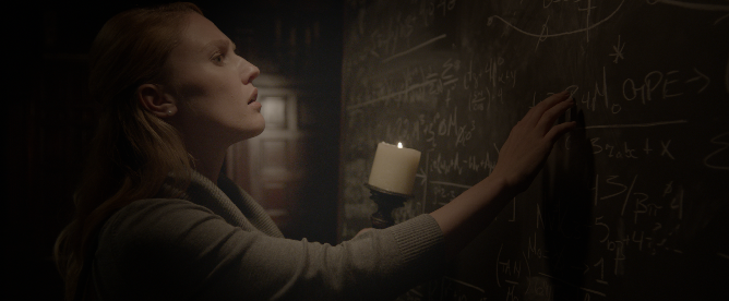
2. Here I have started to grade the image. As this is a candlelight scene the light needs to be isolated so using a “power window” I invert it so rather than increase the light level of the candle I decrease the light level of the area outside the power window. I am doing this also because the Director specifically wanted the board dark so the writing was slowly revealed as the character walks along the board.
3. Next I invert the widow again (in another node) so now I am working “inside” the selected area and I add warmth to the central part of the image to represent the warm glow of the candle. I do not add color to the outer area as I want the blacks to stay relatively neutral. If I warmed the entire image it would be way too red and would not look natural.
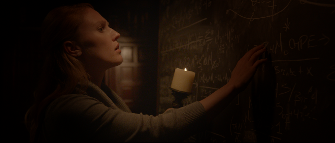
4. As I had darkened down the outer part of the selected area the actors (Jeanine) head basically
disappeared into black. I do not want that. I need a slight amount of separation from the background but I want it to look as if all the light on her and separating her from the background is from the candle. So I now create another power window behind her, adding a lot of edge softening so it is not obvious and raise the base black level of the image just enough to give separation of her hair from the background but not so much that it looks un-natural.
The image is starting to look close at this point BUT the area around the candle is not bright enough to look realistic. The area near the candle should be brighter than anywhere else so I need to add one more power window specifically for the candle.
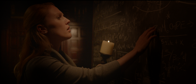
5. This is the final shot with all the power windows and corrections added to make the shot work. The last thing I have to do is set up a tracking vector for all the power windows as this is a moving shot in the film so all those windows need to be moving with Jeanine, and they also have to move and look like they are realistically a result of the light coming from the candle. At the end of the shot Jeanine moves from the board turning to Rinaldo so I also have to remove some of the windows (without that being noticeable) so when she turns those windows do not turn with her as that would look ridiculous.
This is the most important shot in this scene so once this is graded I then go through all the shots in the scene and balance them in mood, color, contrast and brightness to give the entire scene a coherent feel and look totally believable


